Skip to content

Blog 6: Early Findings

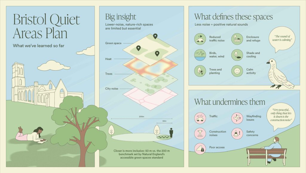
The Bristol Quiet Areas Plan is exploring how quieter, nature-rich urban spaces can better support wellbeing, inclusion and confidence in navigating the city.

The soundwalks and engagement activities show that these spaces are shaped as much by access, arrival and sensory experience as by noise levels alone.

Illustrated infographic titled “Bristol Quiet Areas Plan - What we’ve learned so far.” The design is split into three panels on a soft blue and green background. Left panel shows a stylised landscape with a historic church ruin, trees, clouds, and a person lying on grass reading. Centre panel titled “Big insight” shows layered map graphics highlighting factors affecting quiet spaces: green space, heat, trees, and city noise, with location markers and a note that lower-noise, nature-rich spaces are limited but essential. A caption at the bottom states that closer access (50m vs. 200m) is more inclusive. Right panel has two sections. “What defines these spaces” lists features such as reduced traffic noise, birds/water/wind sounds, trees and planting, enclosure and refuge, shade and cooling, and calm activity, alongside a speech bubble reading “The sound of water is calming.” Below, “What undermines them” lists traffic, construction noise, poor access, wayfinding issues, and safety concerns, with another speech bubble noting construction noise disrupts peacefulness. A small illustration shows a person sitting on a bench.

Key findings emerging from the first phase include:

Three-panel illustrated infographic about “quiet” nature spaces. The left panel, titled “Lived experience,” shows a winding journey from “Route” to “Arrival” to “Experience,” with notes such as “Natural sounds are calming,” “Stress often before arrival,” “People are ok if calm,” and “Access shapes experience.” An illustrated park scene at the bottom shows people seated along a path, with a speech bubble reading “Really stressed before trying to find it.” The centre panel, titled “Key outcomes,” lists ticked points: “Defined what a ‘quiet’ space actually is,” “Created criteria for mapping spaces,” “Identified key barriers,” “Foundation for Quiet Areas Map,” and “Combined lived experience and environmental data.” Below, a section titled “Why it matters” highlights benefits with icons: reduces stress, improves wellbeing, supports biodiversity, supports neurodivergent users, supports cooling and climate resilience, and enables confident movement. The right panel features the message “Lower-noise, nature-rich spaces must be designed and made accessible,” above illustrations of trees, greenery, and sky with clouds. The overall design uses soft colours, simple line drawings, and a calm, nature-themed style.

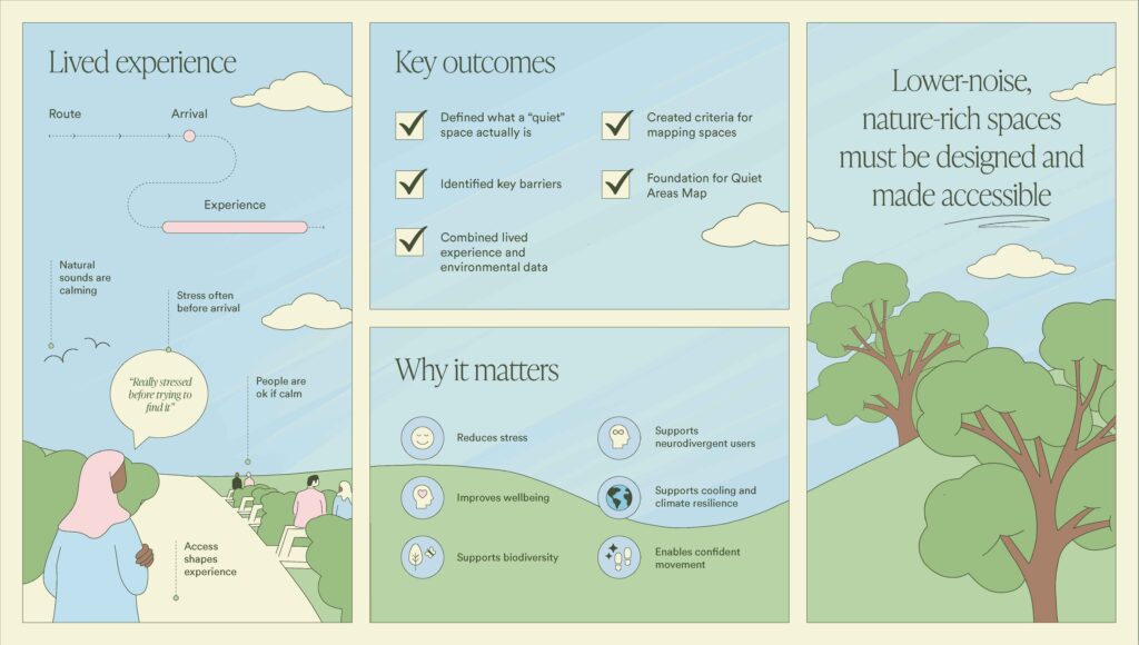
The findings are now shaping the next stages of the project, including: